Friday, January 31, 2025

Analysis for the correlation between the various parameters of earthquakes-5

In Chugoku Area, Correlation between T (Occurrence Time) and D (Depth) in 19set/163set among 11 epicenters are more than 0.9900. The major correlation lines are in the graph below, 


This result with strong  correlations shows that these occurrence times should be not random. It means the occurrence time of earthquake should follow some rule(s) under the specific conditions (gauges), and that the prediction of earthquakes should be possible with the occurrence time if we can know the rule(s). It may be possible by AI analysis for mega database of Japan Meteorological Agency. 

Analysis for the correlation between the various parameters of earthquakes-4

In Chugoku Are, Correlation between Y (Occurrence Date) and M (Magnitude) in 22set/163set among 11 epicenters are more than 0.9900. The major correlation lines are in the graph below, 

The decreasing correlation lines seems to be the top envelope line (see Analysis for the line chart of epicenter(Magnitude)-2) from #10 (M7.3 in 1927). In fact, both earthquakes around the decreasing correlation lines and M7.3 line were moving from East to West as a tendency. Similarly, earthquakes around the increasing correlation lines were moving from North to South as a tendency. The time line of these earthquakes is as below,

[along decreasing top envelope line]
  • #10 1927/3/7 Northern Kyoto
  • # 8  1943/9/10 Eastern Tottori
  • # 7  1948/6/28 Northern Fukui (mountainous area)
  • # 6  1961/8/19 Ishikawa Kaga region
  • # 5 1963/3/27 Wakasa bay(Fukui)
  • # 3  1997/6/25 Middle Yamaguti
  • # 1  2016/10/21 Middle Tottori
[along increasing top envelope line] 
  • #11 1925/5/23 Northern Hyogo
  • # 9  1940/8/14 Around Oki Island
  • # 6  1961/8/19 Ishikawa Kaga region
  • # 5 1963/3/27 Wakasa bay(Fukui)
  • # 4 1995/1/17 Osaka bay (Awazi Island)
  • # 2  2000/10/6 Western Tottori
[along M7.3 line] 
  • #10 1927/3/7 Northern Kyoto
  • # 4 1995/1/17 Osaka bay (Awazi Island)
  • # 2  2000/10/6 Western Tottori
Some of strong correlation sets have other strong correlations also. As shown before, many earthquake's combinations have strong correlation between E and N.  
 
For the set of #3/#7/#10,

 
For the set of #1/#8/#10,


For the set of #3/#6/#10, #2/#6/#11,etc., the correlations between E and N are strong also.  

Thursday, January 30, 2025

Analysis for the correlation between the various parameters of earthquakes-3

 In Chugoku Are, Correlation between E (East longitude) and N (North latitude) in 39set/163set among 11 epicenters are the most major one. The major correlations are below,

most of epicenters with the conditions (M≧6.5/D≦20km) are on the belt of ENE to WSW. 2 epicenters both in Awagi Island (#4 Great Hanshin Awaji Earthquake) and in Oki Island(#9). On addition to it, including of both #4 and #9, there is the correlation of 1.0000 among #4, #9, and #1 (Tottori Central Earthquake, M6.6 in 2016).  These distribution of epicenters must be not random.

Wednesday, January 29, 2025

Analysis for the correlation between the various parameters of earthquakes-2

 I have found many cases of strong correlation between 2 parameters. But, the parameter combination wasn't fixed. To make clear the rules which combination has strong correlation, I have checked all combination's correlation under the specific condition.

At first, I picked up the earthquakes with conditions as below,

  1. Select the epicenter Area with under M6.5/20km => Picked up rectangle area of Chugoku region from Japan Meteorological Agency as below,

  2. Check all the correlation between 2 parameters of Date(Y)/Time(T)/Lng(E)/Lat(N)/Depth(D)/Magnitude(M) per 3 earthquakes.
  3. Compare the correlations. 

This is table of the 163 correlation sets between 2 parameters of 3 earthquakes within 11 earthquakes.

* These values are 10000 times of correlation for convenience of input in this table. (Ex. R^2=1.0000 => 10000)

Because of too many data, the summary table is as below,

** The columns are sorted in order of "Number of more than 0.99". 

In spite of the same data size, There is great variability of values of "number of more than 0.99" (4-39set). The biggest 3 combinations are below, 

  1. Correlation between E (East longitude) and N (North latitude) 39set
  2. Correlation between Y (Date of occurrence) and M (Magnitude) 22set
  3. Correlation between T (Time of occurrence) and M (Magnitude) 19set 
  4. These combination seems to be not random at least. For the correlation between E and N, the tendency can see in the first figure except 2 epicenters of Awagi-island (Great Hanshin Awaji Earthquake)/Oki-island(M6.6 in 1940).


Saturday, January 25, 2025

Analysis for the correlation between the various parameters of earthquakes-1

For the prediction future earthquakes, we must find out the rule of the occurrence of them. My first attempt was only the observation of huge data with making various graphs and charts. I have started trying to check the correlation between the various parameters of earthquakes in the meantime. Sometimes, I have found some of the linear relationships between parameters. Next, I show one of the example.

There is one set of 3 earthquake's parameters as below,

The correlation graph between Day and M in the list is as below,

As same as Day vs M, the correlation graph between E and N in the list is as below,

Next, the correlation graph between Day and D in the list is as below,

Next, the correlation graph between M and D in the list is as below, 

Such these high strong correlation combination in one data set is rare. The epicenters are plotted on the google map as below,

Red mark  is  a epicenter in Ariake Sea. The others are shown by black circle marks.

This distance line cuts the bottom of Misumi peninsula located on the West of Kumamoto Plain. This line cuts an active fault belt named "Futagawa", which is regarded as one cause of Kumamoto Earthquake (M7.3) in 2016. "Futagawa" fault has the misalignment between Misumi side and Kumamoto side. On addition to it, there is almost straight coastline from the root of Misumi peninsula to northward. It may show there may be the fault. It might cut "Futagawa" fault.

It seems the special epicenter set with strong correlation may have some meaning.

Thursday, January 23, 2025

Analysis for the chart of maximun Magnitude per the depth of epicenter (Dragon Chart)

 For the analysis for discrete values, class hierarchy is very useful,especially, in earthquake analysis. Because earthquake is phenomenon occurred in the stacked different layers.

The plotted chart of maximum magnitude per the depth level in Sanriku-oki Area including of Great East Japan Earthquake (M9.0) is as below, 

These 2 plots are for before/after Great East Japan Earthquake. The plots with black line is before it (1919 -2011).  The red line with inclination of 1.00 . The other with blue line is after (2011-2024). For each plots, approximate straight line is added. The maximum magnitude of M9.0 is classified as 20km (orange) depth class because of the value of 24 km. The black plot line has almost no looseness with almost 1.00 inclination. I believe it must have special meaning to be almost 1.00. There was a shrinkage between plots between of 10 km/20km. The depth of M9.0 was 24 km. As the shrinkage depth is near to 24 km, there might have some meaning also.   

Deep depth class (100km & 120km) lie down on the grand line because of the frequency as only 1 time (Ln (1) =0). To be surprised, like as M8 level huge earthquakes are not rare in general. So, sometimes, the maximum magnitude rises up on the vertical axis against the shallower plots. According with shallower depth, the frequency of the maximum magnitude show the tendency rising up higher. It seems to be the reflection of Gutenberg–Richter law.  

The next plotted chart is for in Tokachi-oki Area (1919-2024) is as below,

The plot line twists right and left. It looks like twisting dragon(or snake). Especially, the plot line of in Sanriku-oki just before M9.0 in 2011 looks like rising dragon to sky straightly. These are the reason why I named this plot chart as "Dragon Chart".

Wednesday, January 22, 2025

Analysis for the curve chart of distribution of epicenter (Magnitude)

The curve chart of the ,magnitude distribution in Iwate-oki Area including of Great East Japan Earthquake as below,

Just before Great East Japan Earthquake (M9.0), the frequency distribution curve of magnitude became almost negative quadratic function curve. The correlation coefficient (R^2) was 0.9281. It becomes 0.7697 now. M9.0 was irregular dot for these quadratic function curves. It seems to be similar with the exception of Gutenberg-Richter law in larger Magnitude zone.

The frequency distribution curves of magnitude has many patterns.

The curve chart of the ,magnitude distribution in Kumamoto region Area including of Great East Japan Earthquake as below, 

The top shape of the curve is sharper than one of quadratic function curve. The irregular plots are spread to the negative area of horizontal axis. Most of these epicenters were occurred in Aso region. So, these plots may be caused by volcanic activity of M't Aso(volcano). The irregular plots may be occurred by the difference of the earthquake mechanism.

There are other patterns like as multi peak curves, amorphous, etc. These difference should have the reasonable cause. It must be useful to solve the reasons.


Tuesday, January 21, 2025

Analysis for the curve chart of distribution of epicenter(Depth)

 To know a distribution of discrete values, histogram is usually used. There is Frequent tendency of the occurrence of Earthquakes in specific depth according with the local area. For such characteristics of discrete variable of the depth, the curve chart of depth class is used. 

The curve chart of the depth distribution in Iwate-oki Area including of Great East Japan Earthquake as below,

As the  deeper area's frequency is low, it seems to be redundant. So, double logarithmic graph is used as below,

This pattern seems to be ultimate one because of M9 huge earthquake. No need to say, not all curve have the peak of the curve in the shallow depth. This curve seems to be one of the reason why I believe earthquakes come from deeper epicenters. As 0km can't be used for logarithmic scale, 1km is used as the class value instead of it.

The double logarithm graph is Earthquake frequency per depth Chart in Niizima&Kozu island Area as below,

If the data of "Details unknown" with no magnitude is regarded as 1 km depth, the curve can become the similar line of blue as "in Sanriku-oki". So, I believed data of "Details unknown" as 1km depth.It seems to be too shallow to de fixed the depth, or to be slow slip epicenters. Anyway, in this site,  "Details unknown" is regarded as 1km depth data.

Monday, January 20, 2025

Analysis for the Area chart of epicenter(Magnitude)-3

The 6th "Accumulated value Chart" is for The Niigataken Chuetsu-oki Earthquake
(M6.8) in 2008 as below, 

There were 2 other area peaks in 2011/2024. They were aftershocks of Great East Japan Earthquake (M9.0) and of Noto Peninsula Earthquake (M7.6) . Both of the epicenter are outside of this Area.The main depth was shifted from Yellow area (10km) to Orange area (20km) by The Niigataken Chuetsu-oki Earthquake (M6.8) in 2008. Then, by M9.0, it was turn back to Yellow area (10km) /Red area (1km). By M7.6, it has turn to Orange area (20km) /Red area (1km) .

The 7th "Accumulated value Chart" is for The Noto Hanto Earthquake (M6.9) in 2007, and the common as the first one is for Noto Peninsula Earthquake (M7.6) in 2024.  

The 8th "Accumulated value Chart" is for The Mid Niigata prefecture Earthquake (M6.8) in 2004 as below, 

After the peak of M6.8, there are 2 major peaks of Yellow area in 2007 and of Red area in 2011. They are aftershocks of The Noto Hanto Earthquake (M6.9) and of Great East Japan Earthquake (M9.0). There is no major peak for Noto Peninsula Earthquake in 2024 (M7.6) even though nearer and larger than The Noto Hanto Earthquake (M6.9) in 2007. Maybe, both M6.9 in 2007 and M9.0 in 2011 had taken away aftershocks before it. These Red Area peaks were very remarkable.

The 9th "Accumulated value Chart" is for The Tokachi−oki Earthquake (M8.0) in 2003 as below,

There was 2 major peaks in this graph. One was the area peak of Red (1km)/Yellow(10km)/Green(40km)  caused by The Tokachi−oki Earthquake (M8.2) in 1952. The other was the area peak of Yellow green(30km)/Green(40km)/Light blue(50km) in 2003 caused by The Tokachi−oki Earthquake (M8.0) in 2003. These Tokachi−oki Earthquakes are very similar as below,

The difference of the depth area  component between them may be the order. This phenomenon is similar with the relationship between 2 earthquakes in Noto as explained above.

The 10th "Accumulated value Chart" is for The Western Tottori prefecture earthquake (M7.3) in 2000 as below, 

There are 4 major peaks of in this graph. The first one was the area peak of Red (1km) caused by Tottori earthquake (M7.2) in 1943. The 2nd one is the area peak of Red (1km)&Yellow(10km) caused by The Western Tottori prefecture earthquake (M7.3) in 2000. The 3rd one was the area peak of Yellow(10km) caused by nameless earthquake swarm (max M5.6) in 2001.The 4th one was the area peak of Red (1km)&Yellow(10km) caused by Central Tottori earthquake (M6.6) in 2016.Before M7.3 in 2000, there is small area peak of Yellow(10km) and long silent term of Red(1km) as about 11 years.

As showed 10 cases of main earthquakes in 2000-2024,  "Accumulated value Chart" is useful for the check of the mode change, and sometimes there are some advanced sign of big earthquakes.

Sunday, January 19, 2025

Analysis for the Area chart of epicenter(Magnitude)-2

The 5th "Accumulated value Chart" is for The Iwate-Miyagi Nairiku Earthquake (M7.2) in 2008 as below,

There were 2 major peak. One was M7.1 in 2003. The other was M7.2 in 2008.They changed the pattern of the depth distribution in this area before and after completely. Great East Japan Earthquake changed in 2011 also, but, no remarkable peak there was. The difference between 3 earthquakes are listed in the table.

To clear the effect of the red area(1km), only 1km accumulated is picked up as below,

As the horizontal axis is non-linear, they have the different scale between full depth and only 1km. Before M7.2 in Jun 2008, there was small red area peak in Des 2007. It seems to be the advanced sign of M7.2.No peak was caused by no data of magnitude of "Details unknown". They are treated as 1 km depth class of epicenter in my site.(It's never the official opinion of Japan Meteorological Agency.)

Saturday, January 18, 2025

Analysis for the Area chart of epicenter(Magnitude)-1

Most of earthquakes in the same area is single per day unless after big ones. So,the sum of magnitude per day can show the activity level in the area even though the values themselves have no meaning. Furthermore, by separating the sum per the depth class, it can show which depth is more active also. I defined the sum as "Accumulated value" of magnitude, and separate it per depth class(1km,10km,etc.).

I show will show the "Accumulated value Chart" for 10 major earthquakes after 2000 year. The first one is for Noto Peninsula Earthquake in 2024 (and The Noto Hanto Earthquake in 2007) as below,

There are more red (1km) and yellow (10km) area, especially after M7.6/M6.9. There are remarkable red area before them also, and there are long silent terms before the signs. It means red area (1km) may be the previous sign to great magnitude earthquakes.

The next chart is for Hokkaido Eastern Iburi Earthquake in 2018 as below,

There was a big peak of red area related with Eruption of M’t Usu in 2000 before the peak of the Iburi Earthquake(M6.7) in 2018. There was a long silent term (2003-2010) of red area (1km depth) also. After the silent term, there was middle peak of red area in 2014. As the epicenter of M6.7 was 37km, there was no peak of red area just after it. But, red area occurrence had great effect to M6.7.  

The 3rd chart is for Kumamoto Earthquake (M7.3) in 2016. As same as in Noto, there are much red area (1km) and yellow area (10km) totally. There were middle  peaks of red in 1975 and yellow in 2000. In 1990, Fugendake was erupted in 1991. As same as Kumamoto Earthquake,  eruption seems to have deep relationship with earthquake.

The 4th chart is for Great East Japan Earthquake(M9.0) in 2011 as below,

There are many peaks of big earthquakes more than 10 times of over M7. "Accumulated value" of magnitude per depth are added on in descending order of depth. The reason why is that less depth is more frequent and more important for the check of the activity level. As the total value itself has no great meaning, the vertical axis value is cut by 50[M]. Horizontal axis is non-liner.

Friday, January 17, 2025

Analysis for the line chart of epicenter(Magnitude)-2

For the prediction of magnitude earthquake, envelope lines seem to be useful.

The  line chart of magnitude in Sanriku-oki Area (rectangle area) with envelope lines is as below,

There are 2 kind of envelope lines. One is the top envelope lines for local maximum plots. The other is the bottom envelope lines for local minimum plots. For local period, all magnitude values with it are between top/bottom lines. Crossing these envelope lines may shows the pattern changes, and the too more/less excess values may often be the sign of sudden change like rapid increase of later value. As showed the previous page, sometimes the top envelope line of short term covers the excess value from the envelope line of long term. Around in 2007, there were rapid divergence of magnitude range between top/bottom envelope lines just after rapid convergence of them. It seems some sign of M9.0.   

Thursday, January 16, 2025

Analysis for the line chart of epicenter(Magnitude)-1

The  line chart of magnitude in Sanriku-oki Area (rectangle area) as below,

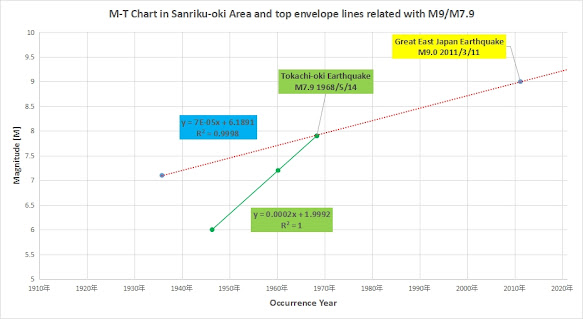
For the predictive analysis of M9.0 (Great East Japan Earthquake)/M7.9 (Tokachi-oki Earthquake), some envelop lines are added on the graph as below,

3 red lines are related with M9, and one green line is related with M7.9.

3 red lines as approximation line are picked up, and extended until near M9 plot.

Each correlation coefficient(R^2) is 1.0 (because of only 2 dots). The intersections are nearby M9.0 even though there is about 3 years error against the real date of occurrence.

For M7.9 (Tokachi-oki Earthquake), one envelop line is added as green line, and picked up in the graph below,

The red line is as same as for green dots in the graph above. But, as there is only one envelop line at the occurrence of M7.9, the occurrence time couldn't be predicted.The correlation coefficient(R^2) of 3 dots is 1.0 including M7.9.

Even though I found these envelop lines, there is problems how to find out them/how to judge the extension length still. But, some candidate of envelop line may help the predict of earthquake magnitude.

Wednesday, January 15, 2025

Analysis for the line chart of epicenter(Depth)

As showed ""Analysis for the line chart of epicenter(Lat/Lng)", the trend of 0km(1km) data of epicenters is very important. The trend graph in Sanriku-Area(1919-2015) is showed as below,

There is the longest silent term of 0km(1km) epicenter in the black circle.The graph area without 0km(1km) epicenter looks like blank area towards deeper epicenters.The next graph shows MD trend. MD is defined as the product between the magnitude and the depth of each epicenter. closed up the blank area is as below,

To show the blank area of  0km(1km) in details is as below, 

MD range is limited to close up the blank area.2 red lines are envelope lines to be connected of local minimum values in the blank area. It seems they may be useful for the prediction of Great East Japan Earthquake(M9.0).

* All data was downloaded from the site of Japan Meteorological Agency. I have arranged the data into graphs.Please see this page.

Tuesday, January 14, 2025

Analysis for the line chart of epicenter(Lat/Lng)-2

For the analysis of Noto Peninsula Earthquake(M7.6) in 2024/1/1, the time series graph of the epicenter(Lng) in Noto-pen.Area (1919/1-2025/1) is as below, 

The first graph is all data in the area.


The next graph is only 1km epicenter.

1km graph shows the graph pattern change more clearly.Earthquake swarm in 2007 was caused by M6.9 in Noto Offsure.After long silent term,the epicenter' s Longitude moved near to East side once. Then they returned to West side again and M6.9 was occurred. M6.9 is the second scale in all data of Noto-pen. Area. M7.6 in 2024 is the largest one in this Area.

Before M7.6(Noto Peninsula Earthquake), the abnormal earthquake swarm has started since around Aug/2021.But, in the graph with only 1km data, there had been the longest silent term exists just after M7.6.The term was broken only after  14 minutes from M7.6.

The time series graph of the epicenter(Lat) in Noto-pen. Area (1919/1-2025/1) as below, 

The first graph is all data in the area.

The next graph is only 1km epicenter(Lat).

* All data was downloaded from the site of Japan Meteorological Agency. I have arranged the data into graphs.M7.6 was occurred in land area as Noto-resion, and M6.9 was occurred in sea area near by the coast.About area definition, please see this page.

Monday, January 13, 2025

Analysis for the line chart of epicenter(Lat/Lng)-1

To predict future phenomenon, time series graph is very important.

For the analysis of Great East Japan Earthquake(M9), the time series graph of the epicenter in Sanriku-oki (1919/1-2011/3) Area as below,

Even just before Great East Japan Earthquake,it seems there is no previous indication of it in these above graphs. The some increase of occurrence has been seen, but data in 1969 was far more. So, I tried to classified the data per the depth level per 10km. As I showed, 0km(treated as 1km) is the main data. In this case, 1km data showed the most remarkable results as below,


There is long silent term before M9. For easy finding, these charts are for in 1919-2025. Unfortunately, the end of this long silent term was just after about 3hours. But, in other cases, the end times are before big earth quakes. Anyway,long silent term can show the possibility of great earthquakes as far as I have checked other data.The same pattern before M9 can be found along Japan Trench in many area.

There is another long silent term in 2012-2025 also.The outer-rise earthquake against M9 has not been confirmed. 

MD-T chart in 釧路地方北部

 MD-T chart in 釧路地方北部  (redefined rectangle area of North Kushiro region)